
I tried making a UI Library
Big mistake 🥹.

My readers are probably wondering what I’ve been up to since my articles dried up for a rather long while. Life happened, mostly. Everything from the birth of a new child, to the other child catching pneumonia, to a suicidal cat jumping out the window and needing to be fed through a tube in her neck for a couple of months (she recovered!).
That was the main reason for the drought, but another reason is a project I’ve been working on: a UI library called SUIT (Stylish User Interface Toolkit).
Think Electron, but in Reverse
Every project needs a raison d'etre, a reason why it exists. Sometimes that’s just to scratch an itch or learn something new, other times it’s an attempt at targeting an unmet market need. SUIT is the latter, I’m trying to target a similar market to Electron, but in reverse1:
Electron turns web apps into cross-platform native apps.
SUIT turns cross-platform native apps into web apps.
There are already various libraries that are used to develop native apps2 that can also target the web (Qt, Avalonia, etc.), but that’s not really what I mean. Those libraries produce native apps and those native apps can then run on the web, but the resulting “web app” is not really a “web-native” app, so to speak.
Just as Electron apps can feel somewhat out of place, Qt and Avalonia apps feel extremely out of place on the web, far worse than Electron apps do on the desktop. Qt and Avalonia custom render everything, so you don’t get the usual HTML and CSS behaviors one would normally expect from a web app. They’re also very large, and that size adds to the size of the exported web app. Small size still matters on the web, and neither Qt nor Avalonia are very good in this regard.
SUIT does not work like Qt or Avalonia, it is more like libUI or wxWidgets in that it wraps the native UI toolkits provided by the operating systems, plus HTML + CSS on the web. This introduces some very harsh design constraints, but so far nothing insurmountable.
What does SUIT do differently from libUI and wxWidgets then? It has to do with the “S” in the name (which stands for “Stylish”); SUIT neither uses nor mimics the native platform’s appearance. The core tenet of SUIT is:
Custom Look, Native Feel
Why not use the native look? Read on.
The Native UI Toolkit Disaster
There are no two ways about it, the native UI toolkits mostly suck. I’ve covered the absolute disaster that is Windows previously, so I won’t go into it in detail again, but the TL;DR is that Windows has an absolute graveyard of half-finished UI toolkits, and you simply cannot trust any Microsoft provided API not called Direct3D3. I’ll explain what I do regarding Windows later.
Apple-land fares better, but the cracks are starting to show. AppKit is very good, but even AppKit has quite a few limitations compared to some of the things you can do on the web. As an example, even something as trivial as a different radius per corner is something CoreAnimation does not support (you can mask some to 0, but that’s it). Same with a different border color per side. You can always do it yourself with multiple vector shape layers or by custom drawing with CoreGraphics, but that’s a lot of extra work.
Now there’s SwiftUI which Apple refuses to decide if it’s just a React-ish wrapper around AppKit, or 100% “the future” and AppKit is just an implementation detail for the time being. We might be looking at a Microsoft-like situation here eventually.
On Linux there are Qt and GTK, and both have issues.
Qt is quite good, but it’s been a bit of a mess since the introduction of QtQuick. Why they thought forcing people into QML instead of it being just a nice wrapper on top of a C++ API I have no idea, not to mention the amount of churn QtQuick has gone through. QtWidgets are still there and work very well but they’re clearly an afterthought these days.
GTK is actively developer hostile. They have backtracked on what must have been the stupidest thing I’ve ever read from the developer of a “platform API” (i.e., actively breaking backwards compatibility every 2 years, on purpose), but the fact that they wrote it at all is horrifying. They’ve also removed lots of widgets that could have been reimplemented as wrappers around their new APIs. No thought given to developers who just wanted an easier upgrade path from GTK 3 to 4.
Qt also breaks backwards compatibility between major versions, but it goes out of its way to make the transition as painless as possible.
The Native UI Style Disaster
On top of all of this, you also have the native style churn. The shift from Windows 7 to 8 was brutal, there was absolutely no way a “native app” could have adapted. The WPF ribbon control kept the very skeumorphic gradient for a long time, which looked horrifically out of place on Windows 8 (not to mention it broke the window chrome). Windows 8 was also hideous, but that’s just my subjective opinion.
Apple has now introduced liquid glass which is 100% the ugliest desktop UI style ever created, and this one is my objective opinion4. Here too adapting a native app that followed older styles would be a nightmare, even if it used native widgets almost exclusively (you have to adjust how your app is laid out to make the glass effect actually matter, or you end up like Apple’s own half-baked apps that look downright schizophrenic).
And there’s absolutely no way to design a cross-platform app that would “fit in” everywhere. Not only do style guidelines keep changing within the same operating system family across versions, they’re also different across operating systems. The only way to get something truly native looking is to maintain an entirely separate UI for each platform and to redo each of those UIs whenever an OS provider decides to overhaul the style to distract from the falling quality of their software.
And for what? Aero and Aqua were beautiful and hard to replicate, it would have cost you a pretty penny to hire a design team that could pull off that sort of UI, so using the OS-provided widgets bought you a lot. But Windows 8 Metro? Single color rectangles? Trivial. Liquid Glass? Hard to replicate but it’s hideous, why would you want to make your app hideous? If the OS provider design teams suck this hard, you might as well just do your own thing. And software companies have.
The SUIT Proposition
SUIT rejects this whole mess, and uses the system-provided toolkits only where they provide actual value, their default looks be damned. Your app, your branding.
Nearly every cross platform app these days has given up on “native look and feel”. Even when the app isn’t just a web app bundled with Chromium, the app follows the company’s own style guidelines and branding, rather than the operating system provider’s guidelines (with good reason, cuz they suck these days!). If you use Photoshop on Windows or on macOS, it looks the same. If you use Blender on Windows or macOS, it looks the same.
SUIT is being developed with this reality in mind. It mostly gives up on native look, while trying to retain some of the feel. It achieves this by using only a limited set of native widgets (e.g., text fields) while removing their default styling entirely. Appearance is then almost completely under the control of the developer. It’s not pixel perfect across platforms, but it doesn’t need to be.
Because it uses the native frameworks, you can always host a native widget alongside the custom ones if you so wish. Some widget like scrollbars are particularly relevant because there are system settings that affect their behavior, which is why SUIT supports native scrollbars by default even though that goes against the “custom appearance” goal (you can use custom scrollbars as well if you prefer).
Even some Electron apps put in the effort to support native context menus, because that little extra bit of platform-native feel makes a big difference.
How SUIT works
SUIT is a C API that communicates with backends written in various languages, like Objective-C on macOS or Javascript on the web.
Backends are responsible for implementing certain primitive operations (like file dialogs and vector drawing) and providing certain primitive widgets (like text fields and scrolling viewports). Backends must also translate SUIT stylesheets into native styling or drawing commands.
More complex widgets like tab bars, tree views and split panels are implemented by SUIT itself, on top of the primitive widgets. The design is very much “composition over inheritance”, where widget constructors are just plain functions that wire up lower level widgets into higher level ones.
Memory management is mostly automatic despite SUIT being a C-library, because deleting a widget also deletes all of its children, and widgets are tracked via IDs rather than pointers, so a widget-related use-after-free always causes a crash rather than memory corruption.
SUIT’s styling system is heavily inspired by CSS, albeit simpler, as styles only affect the widgets they are applied to, there is no “cascading”. The reason it is CSS inspired is not out of preference, but rather to allow a direct translation to CSS on the web. That’s what makes the web backend work so well.
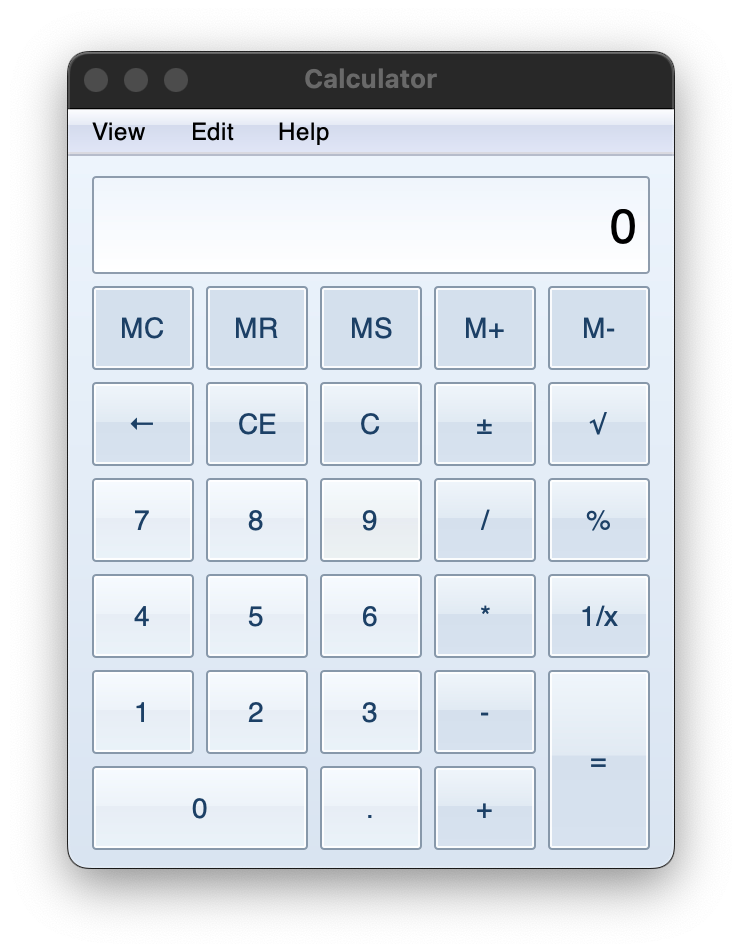
Here’s a little taste of the current API, defining the calculator display style for the Windows 7 lookalike calculator shown previously:
static const SuitStyleProperty display_style[] = {
    suit_height({.px = 49}),
    suit_height_policy(SUIT_SIZE_POLICY_FIXED),
    suit_padding_left(8),
    suit_padding_right(7),
    suit_h_align(SUIT_ALIGN_END),
    suit_v_align(SUIT_ALIGN_CENTER),
    suit_overflow_x(SUIT_OVERFLOW_HIDDEN),
    suit_font_family("Helvetica"),
    suit_font_size(24),
    suit_text_color(WIN7_TEXT),
    suit_background_image_gradient(display_light_gradient),
    suit_border_width(1),
    suit_border_color(WIN7_DISPLAY_BORDER),
    suit_border_radius({.px = 2}),
};
The API is nowhere near finished and has some very rough areas still, but as I keep working on it the eventual API shape starts to emerge.
The Nightmare and the Clankers
When I first started this project, I was quite positive on it. And in many ways, I’m still quite positive on it. The foundational idea does work. SUIT produces highly customizable UIs that nonetheless retain a nice native feel. This is already true today. Typing in a SUIT text field on macOS feels the same as typing in any other macOS text field, all the functionality like autocorrect and such is there. Scrolling a SUIT viewport on macOS feels just like scrolling any other viewport in macOS, including the little bump animation when you scroll against the boundary. It feels native because it is native.
Same goes for the two Linux backends (though they are unfinished). Windows… well, we’ll take about Windows later.
But sadly I severely underestimated the sheer scope of the project. A UI library on the level of something like Qt needs a lot… a LOT of features. Layouting, styling, input and event handling, keyboard navigation, animation, accessibility, all the different widgets, etc. Now multiply all of that to 5 different backends. It’s not insurmountable, but it is massive.
I also made the mistake of trying to have a “neutral” backend, meaning one that does all the rendering itself instead of relying on the native widgets. I should have used Skia and Harfbuzz like everyone else, but instead I decided to just target the platform provided vector rendering and text APIs. I wanted to avoid non-OS-provided dependencies to keep SUIT as easy to set up as possible and to keep the resulting executables as small as possible.
Big mistake. Huge. I got it working in the end, but it was a nightmare, totally not worth it. The main culprit? Rich Text.
You don’t know hell until you’re trying to get text alignment and selection to work correctly across runs of bidi text on multiple different text layouting and rendering APIs (DirectWrite, TextKit, Pango).
So I turned to clankers5 for help, Claude and GPT to be specific. A faustian bargain.
LLMs are amazing, and yet they suck
Spoiler alert: they eventually pulled it off, but it involved constant, unending regressions (despite plenty of test cases, it’s a hard problem and mostly visual, which is hard to test).
People sometimes describe the experience of working with LLMs as being like working with a junior dev, but it’s not like that at all.
Juniors start out not really knowing what they’re doing, but slowly develop into a proper developer. You, as a senior, maintain a mental model of the junior’s capabilities, allowing you to predict the outcome of their work and thereby delegate tasks to them effectively. You know what to expect and can plan accordingly. Very quickly you begin to trust them, as least for the level of tasks you know they can currently tackle. And as they improve, the more you can feel confident in delegating.
LLMs are nothing like that. LLMs are like working with a consulting company that sends a different person to work on the project every day, sometimes every few hours. Each individual person is actually quite skilled, much more than a junior and often better than many seniors… but they just arrived at your project. They have no idea what it is about, so they first have to get up to speed. They have no attachment to it, no understanding of the company culture that led to the project being structured the way it is. They’ll half-heartedly follow the general guidelines, but everyone knows those are always incomplete.
And because they’re a “different person” each time you give a task to the LLM, you cannot develop a mental model of them, of what they’ll do. The only thing you can trust is sending them a very detailed spec with automated tests. The quality of the code you get in the end? Who knows. Did they touch stuff they shouldn’t? Maybe, you gotta check. Pretty much the way it is with a consulting company made up of humans today, only 10x worse because instead of having the same person for a few months, you have them for less than a day.
But with my life being as exhausting as it was these past few months, I just delegated everything to the LLMs after the whole rich text adventure started. The more they wrecked the codebase the more I delegated to them because I couldn’t muster the willpower to clean it up. It’s amazing what they ended up accomplishing, but that lack of consistency in their output is killer. You have to not care about the final result to really take advantage of LLMs at the moment, but I’m unable to do so.
What’s Next
I’m not going to stop using LLMs for this project, but I will start being a lot more intentional about their use. There’s no way I’m releasing a (partially) vibe-coded monstrosity into the world. I will use the LLMs to do experiments and to take care of annoying boilerplate, but I will take full ownership of the code, meaning the most I’ll allow an LLM to produce at a time will be a few hundred lines of code I can immediately review and fix.
My goal is to have the first public version of SUIT out by the end of the year. It’ll be open source, likely under the MIT license.
Side-note: The Windows Problem
Windows is a bit of a special case, as building things out of the classic Win32 common controls doesn’t really work very well, because they don’t compose. They also do not support any sort of alpha transparency. Maybe there’s a good way to make it work but I haven’t figured it out yet. Instead the current idea is to custom render with Direct2D, DirectWrite, and DirectComposition, and use an API called ITextServices to handle all the text editing. Context menus can be native Win32 since they are not part of the main window. Only scrolling viewports will unfortunately not be very native feeling, but not much I can do about that.
The alternative is to use the latest Microsoft recommended API, WinUI3, included as part of the WindowsAppSDK. Sadly, WinUI3 has the problem that it is not actually distributed with the OS, not in the same way Direct3D is. Rather, the user must install the appropriate version of the runtime.
There are three different ways to do this. The recommended way is to distribute the application as a .msix installer, which can then pull the correct 100+ MB version of the runtime from the Microsoft Store if it is not already installed. Think Flatpak runtimes on Linux for something somewhat equivalent. I might support this as an alternative Windows backend in the future if WinUI3 proves itself, but remember what I said about a graveyard of half-finished UI frameworks? Yeah…
The other two ways are:
Distribute the 100+ MB runtime installer alongside your application’s installer. Fine if your application is huge, not fine if your application is less than half a megabyte like the SUIT notepad demo. You have to install the correct minor version of the runtime, it is not backwards compatible.
Distribute just the necessary DLLs with the application. Sadly we’re talking more than a dozen DLLs here, totaling at a minimum around 30 MB in size.
Considering that SUIT can do what WinUI3 does in tiny fraction of the size, you really have to wonder what in the world WinUI3 is doing under the hood.
Conclusion
So that’s what I’ve been up to, not dead (yet), and I’ll hopefully get back to writing articles more regularly soon. Thank you all for not unsubscribing meanwhile, I really appreciate the support.
Why is SUIT not called “Proton” or “Positron” or some such if it is a “reverse Electron”? Because it is not a reverse Electron, that’s just the easiest way to explain the product-market fit. You should never define your projects as the negative of something else, unless they are exactly that. Otherwise you’re just tying yourself down. If “Electron” suddenly loses popularity, then any project defined as its opposite loses relevance. SUIT is like a reverse Electron in what it tries to achieve, but otherwise has no similarities. It would have merit even if Electron did not exist.
Native here meaning “not a web app bundled with Chromium”, because they don’t use the native OS-provided UI frameworks under the hood. Those are a different sort of “native”.
No, not even Win32. You can trust it to always be there, sure, but not that it will get proper high-quality updates over time like Direct3D has had. Dark mode isn’t even officially supported by the Win32 common controls, you have to use undocumented APIs and they’re highly incomplete.
Grey text over an animated glass effect is completely unreadable and totally unacceptable. A stack of different corner radius in different apps from the same company on the same OS is unacceptable. Covering entire context menus in nearly indistinguishable icons is unacceptable. There’s a reason they backtracked on most of these, but that doesn’t mean it is no longer terrible, it just makes it usable.
Clankers = “AI” agents, meaning Large Language Models.